

Background and project
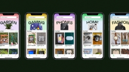
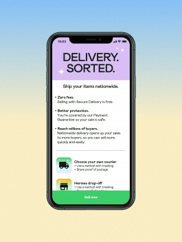
Originally launched in 2012, Shpock has been downloaded more than 50 million times across Europe. This year has seen the introduction of a range of new features that pivot Shpock to a UK-wide transactional marketplace. Buyer protection, secure delivery, and payment within the app now mean that users can buy and sell securely to anyone across the country.
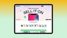
Koto was brought in to create the new brand strategy, visual and verbal brand, and tagline. The new brand is currently rolling out across the mobile app and website and will underpin Shpock’s future communications and messaging.



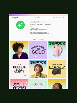
Our brand idea and tagline ‘The Joy of Selling.’ is represented throughout the new visual and verbal brand. Shpock users can expect a playful, enthusiastic and self-assured verbal tone that reflects its evolution from a local classifieds board, to a nationwide transactional marketplace.
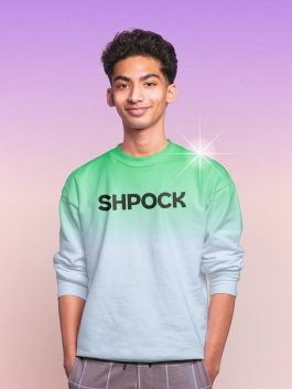
Our photography represents buyers and sellers from the Shpock community with beautiful portraits that emphasise the joy of selling to someone, somewhere. We pair these with cutout images of the bought and sold objects, creating a compelling composition that is both functional (the item) and emotional (the person).




Other brand assets include the ‘Shparkle’, a visual manifestation of joy that adds lighthearted and playful moments to our communications. Highlighting and elevating marketplace products in the communication narratives.
For the bespoke font we collaborated with Colophon to repurposed a pre-used typeface, with some secondhand love. We designed the typeface to express the joyful state of selling and buying on Shpock, with some new glyphs that represent a smile.


“Shpock has seen big changes this year, and as we evolve into a transactional UK-wide marketplace, we need a brand that reflects our new position in the market. Our vision for Shpock is to create a fast, safe, and trusted marketplace, and with our all-new look, we can communicate what makes Shpock so special. From our bold new font to the fun and playful Shparkle, we think our new brand will bring a smile to new and existing users as they experience the joy of selling.”
Esteve Jané | Shpock CEO

Thank you
With thanks to the whole Shpock team, Colophon, Andy J Scott and many more for the work on this project.
Full casestudy at Koto
↑
MORE WORK
Background and project
Originally launched in 2012, Shpock has been downloaded more than 50 million times across Europe. This year has seen the introduction of a range of new features that pivot Shpock to a UK-wide transactional marketplace. Buyer protection, secure delivery, and payment within the app now mean that users can buy and sell securely to anyone across the country.
Koto was brought in to create the new brand strategy, visual and verbal brand, and tagline. The new brand is currently rolling out across the mobile app and website and will underpin Shpock’s future communications and messaging.


Our brand idea and tagline ‘The Joy of Selling.’ is represented throughout the new visual and verbal brand. Shpock users can expect a playful, enthusiastic and self-assured verbal tone that reflects its evolution from a local classifieds board, to a nationwide transactional marketplace.
Our photography represents buyers and sellers from the Shpock community with beautiful portraits that emphasise the joy of selling to someone, somewhere. We pair these with cutout images of the bought and sold objects, creating a compelling composition that is both functional (the item) and emotional (the person).


Other brand assets include the ‘Shparkle’, a visual manifestation of joy that adds lighthearted and playful moments to our communications. Highlighting and elevating marketplace products in the communication narratives.
For the bespoke font we collaborated with Colophon to repurposed a pre-used typeface, with some secondhand love. We designed the typeface to express the joyful state of selling and buying on Shpock, with some new glyphs that represent a smile.


“Shpock has seen big changes this year, and as we evolve into a transactional UK-wide marketplace, we need a brand that reflects our new position in the market. Our vision for Shpock is to create a fast, safe, and trusted marketplace, and with our all-new look, we can communicate what makes Shpock so special. From our bold new font to the fun and playful Shparkle, we think our new brand will bring a smile to new and existing users as they experience the joy of selling.”
Esteve Jané | Shpock CEO


Thank you
With thanks to the whole Shpock team, Colophon, Andy J Scott and many more for the work on this project.
Full casestudy at Koto
↑
MORE WORK