


It’s the system that’s sick
In the US market, accessing even basic prescription medications can be time-consuming and expensive. Nurx delivers birth control, PrEP and other sexual health treatments on-demand, no insurance needed. With a focus on overhauling a broken system, they needed a brand to match their attitude and aspirations.

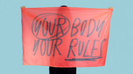
Our bodies our rules
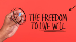
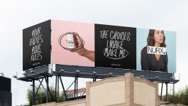
We began by developing a brand strategy based around the three things Nurx gives its users: greater control over their bodies, more choice of affordable treatments and the freedom to live well - in exactly the way they want. This gave the starting point for a bold visual and verbal identity.

Radically real care
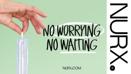
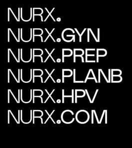
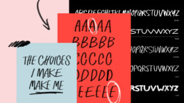
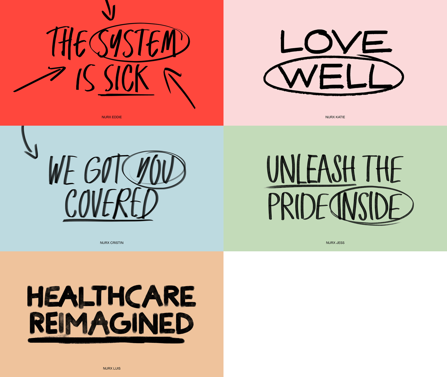
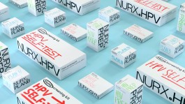
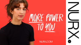
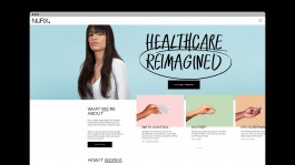
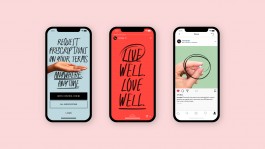
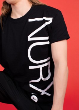
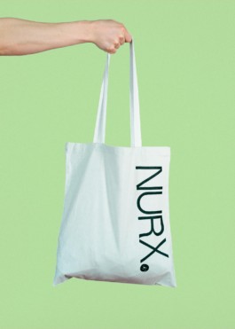
We wanted the new brand to be both a revolutionary rallying cry and a reflection of the high standard of care provided by their qualified physicians. This is reflected in the five new custom typefaces that embody both the spirit of protest and the familiarity of doctors’ handwritten prescriptions. The new brand is anchored by a single-minded wordmark that cements Nurx’s presence in the healthcare space. This is paired with a hand-drawn full-stop to underline their intent, and the start of a new chapter in the healthcare industry.
A celebration of people
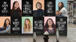
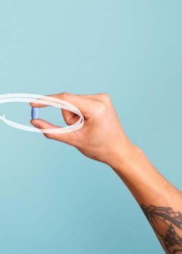
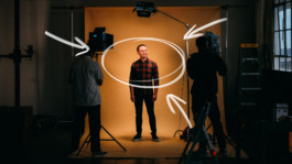
After interviewing Nurx users and physicians in Miami, Dallas, Indianapolis and San Francisco, we wanted to put them right at the heart of the new brand. So we spent a week between San Francisco and Miami photographing 27 of them in a candid art direction style that feels like a real movement.

Thank you
With thanks to Hans, Eddie, Katelyn and the rest of the Nurx team. Bobby Tannam for engineering the typefaces.
Produced as part of a team at Koto
↑
MORE WORK

It’s the system that’s sick
In the US market, accessing even basic prescription medications can be time-consuming and expensive. Nurx delivers birth control, PrEP and other sexual health treatments on-demand, no insurance needed. With a focus on overhauling a broken system, they needed a brand to match their attitude and aspirations.


Our bodies our rules
We began by developing a brand strategy based around the three things Nurx gives its users: greater control over their bodies, more choice of affordable treatments and the freedom to live well - in exactly the way they want. This gave the starting point for a bold visual and verbal identity.


Radically real care
We wanted the new brand to be both a revolutionary rallying cry and a reflection of the high standard of care provided by their qualified physicians. This is reflected in the five new custom typefaces that embody both the spirit of protest and the familiarity of doctors’ handwritten prescriptions. The new brand is anchored by a single-minded wordmark that cements Nurx’s presence in the healthcare space. This is paired with a hand-drawn full-stop to underline their intent, and the start of a new chapter in the healthcare industry.


A celebration of people
After interviewing Nurx users and physicians in Miami, Dallas, Indianapolis and San Francisco, we wanted to put them right at the heart of the new brand. So we spent a week between San Francisco and Miami photographing 27 of them in a candid art direction style that feels like a real movement.


Thank you
With thanks to Hans, Eddie, Katelyn and the rest of the Nurx team. Bobby Tannam for engineering the typefaces.
Produced as part of a team at Koto
↑
MORE WORK