

The brief / Considerations
Apart from a few minor tweaks, Fiverr’s brand has remained largely the same. Its identity has a tendency to vary based on whichever ad campaign is out in the world. The Fiverr team saw this as a chance to consolidate their brand assets and reaffirm what they stand for, all the while looking to the future with a brand that leaves them well placed to lead the workplace revolution.
Perception of Fiverr within the design community is mixed, with debate raging about the commodification of creativity. We were aware of this reputation and went into the project with our eyes fully open. But in fact, many of us have been freelance in the past, and support the ability to work flexibly with clients. Ultimately we decided that there’s real merit in working with a business that’s creating new opportunities for creative people all around the world to be able to do what they love, and be paid for it. The Fiverr team talk passionately about levelling the playing field — and it’s a sentiment we support.
The project kicked off at the end of February 2020. As such, everything had to be carried out entirely remotely. This was a real departure from our usual process as a studio. We typically spend time in a client’s office, meeting the team and immersing ourselves in the challenges in person. Covid meant we had to work extra hard to keep communication and collaboration flowing across 5+ timezones. Daily check-ins and catch-ups, creative presentations, workshops, and product sprints all had to happen remotely. The result was a creative partnership made possible by the kind of remote collaboration that Fiverr specializes in.
Fiverr is infused with an energy and determination embodied in a spirit of ‘doing’ — a mantra that permeated the business and brand. We were set on preserving this sentiment, while also creating an identity that embodies their new brand strategy rooted in revolutionizing the way the world works. It’s a far-reaching sentiment that needed a sophisticated, forward-thinking brand to match.
The brand elements
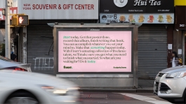
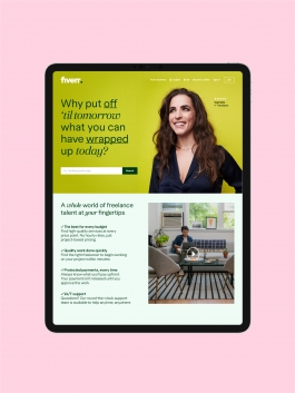
Colour wise, we moved away from a singular green to a broader, more colourful and distinctive palette. This takes the overall brand feel from dark to light and, by pairing the colours in singular combinations, we’ve given Fiverr a multitude of options to choose from, to ensure they can always find a palette to match the tone of a piece of communications.
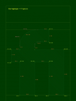
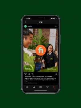
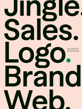
Our bespoke wordmarque is the symbol of the new Fiverr. Understated, yet distinctive, we aim for it to become a strong and confident sign off in everything they do. The ‘fi’ ligature works as a clear and clean shorthand for social channels, app icons and within the mobile experience too.
The brand elements
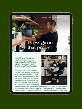
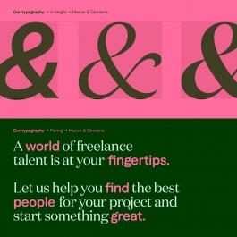
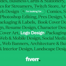
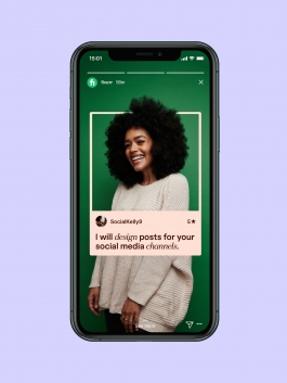
We partnered with Klim Foundry and TightType to introduce two new typefaces to the brand. We brought them together in a strong typographic system, so that they look as good together as they do individually. Combining them in applications gives us the ability to emphasize words and information, and also to express different voices. This is particularly effective when we want to differentiate between the buyer and seller, or the people and platform, and stylistically represent the relationship between the two. This approach to typography gives Fiverr the ability to demonstrate real personality, even in the most recessive parts of the product experience.
The brand elements
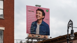
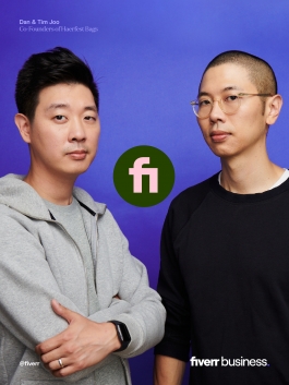
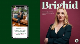
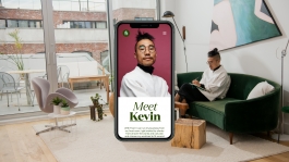
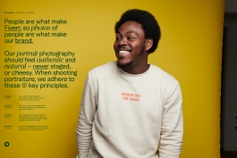
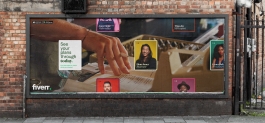
For the art direction, we partnered with photographer Jai Lennard to capture real users from the Fiverr community. We delivered two styles of photography — heroic portraiture and lifestyle imagery — both of which feel natural, relaxed and celebratory. It gives Fiverr the opportunity to document the real people behind the platform.
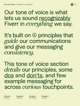
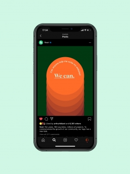
We also evolved the Fiverr verbal identity; delivering a tone of voice that’s warm but businesslike. Messaging is straightforward and to the point, to reflect the ease and efficiency of using Fiverr. Overall the tone celebrates the connections and creative moments that happen every minute on the platform. It’s practical, but people focused, reflecting the professionals behind the process.
Thank you
With thanks to the whole Fiverr team, Micha, Gali, Duncan, Nadav and Zach for their indredible collaboration. Shout out to Jai Lennard for his photography.
↑
MORE WORK
The brief / Considerations
Apart from a few minor tweaks, Fiverr’s brand has remained largely the same. Its identity has a tendency to vary based on whichever ad campaign is out in the world. The Fiverr team saw this as a chance to consolidate their brand assets and reaffirm what they stand for, all the while looking to the future with a brand that leaves them well placed to lead the workplace revolution.
Perception of Fiverr within the design community is mixed, with debate raging about the commodification of creativity. We were aware of this reputation and went into the project with our eyes fully open. But in fact, many of us have been freelance in the past, and support the ability to work flexibly with clients. Ultimately we decided that there’s real merit in working with a business that’s creating new opportunities for creative people all around the world to be able to do what they love, and be paid for it. The Fiverr team talk passionately about levelling the playing field — and it’s a sentiment we support.
The project kicked off at the end of February 2020. As such, everything had to be carried out entirely remotely. This was a real departure from our usual process as a studio. We typically spend time in a client’s office, meeting the team and immersing ourselves in the challenges in person. Covid meant we had to work extra hard to keep communication and collaboration flowing across 5+ timezones. Daily check-ins and catch-ups, creative presentations, workshops, and product sprints all had to happen remotely. The result was a creative partnership made possible by the kind of remote collaboration that Fiverr specializes in.
Fiverr is infused with an energy and determination embodied in a spirit of ‘doing’ — a mantra that permeated the business and brand. We were set on preserving this sentiment, while also creating an identity that embodies their new brand strategy rooted in revolutionizing the way the world works. It’s a far-reaching sentiment that needed a sophisticated, forward-thinking brand to match.


The brand elements
Colour wise, we moved away from a singular green to a broader, more colourful and distinctive palette. This takes the overall brand feel from dark to light and, by pairing the colours in singular combinations, we’ve given Fiverr a multitude of options to choose from, to ensure they can always find a palette to match the tone of a piece of communications.
Our bespoke wordmarque is the symbol of the new Fiverr. Understated, yet distinctive, we aim for it to become a strong and confident sign off in everything they do. The ‘fi’ ligature works as a clear and clean shorthand for social channels, app icons and within the mobile experience too.


The brand elements
We partnered with Klim Foundry and TightType to introduce two new typefaces to the brand. We brought them together in a strong typographic system, so that they look as good together as they do individually. Combining them in applications gives us the ability to emphasize words and information, and also to express different voices. This is particularly effective when we want to differentiate between the buyer and seller, or the people and platform, and stylistically represent the relationship between the two. This approach to typography gives Fiverr the ability to demonstrate real personality, even in the most recessive parts of the product experience.


The brand elements
For the art direction, we partnered with photographer Jai Lennard to capture real users from the Fiverr community. We delivered two styles of photography — heroic portraiture and lifestyle imagery — both of which feel natural, relaxed and celebratory. It gives Fiverr the opportunity to document the real people behind the platform.
We also evolved the Fiverr verbal identity; delivering a tone of voice that’s warm but businesslike. Messaging is straightforward and to the point, to reflect the ease and efficiency of using Fiverr. Overall the tone celebrates the connections and creative moments that happen every minute on the platform. It’s practical, but people focused, reflecting the professionals behind the process.


Thank you
With thanks to the whole Fiverr team, Micha, Gali, Duncan, Nadav and Zach for their indredible collaboration. Shout out to Jai Lennard for his photography.
↑
MORE WORK